In the old times before FileMaker Go, before tab control, before anchors, before multiple windows per file, in the age of 13-inch CRT monitors, the most frequent challenges I was facing when developing FileMaker solutions were:
- How to fit all the necessary information into such small space
- What the hack to put in that weird empty area on the layout
These days we have so many convenient ways to manage the real estate of FileMaker layouts that I often almost forget all the knowledg I gained at those old times.
Until last year…
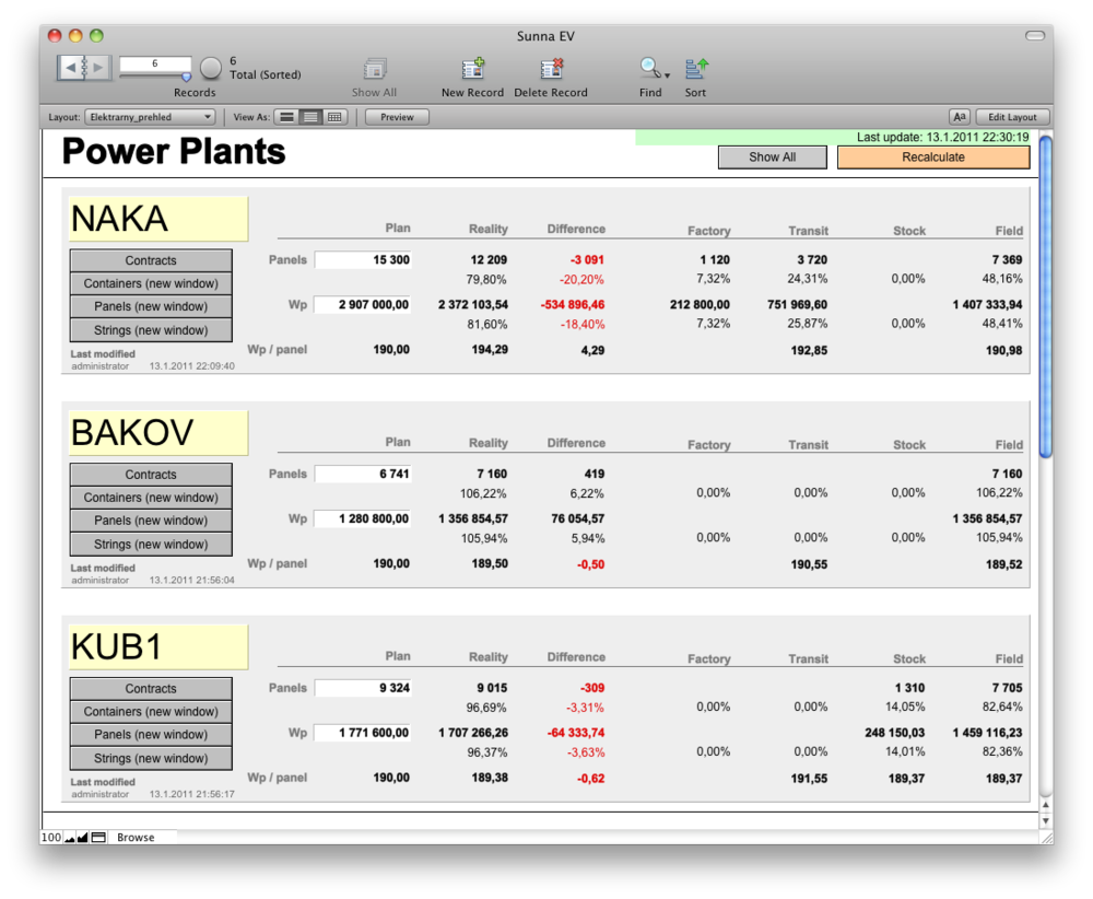
My company was working on a solution for a company building solar power plants. One of their management layouts looked like this:

Pretty usual layout, isn’t it? But wait, what if they want to access the information from iPhone?
I had already played with FileMaker Go quite a bit and I liked the nice design toolkit from Soliant, so I thought it would be a snap…
Only until I discovered how extremely small the iPhone’s screen really is!
320×480 is only half of the pixels the old 13-inch monitors had, and since the iPhone’s pixels are relly small, the smallest font that can be easily read is 14 points. I quickly learned my first big lesson:
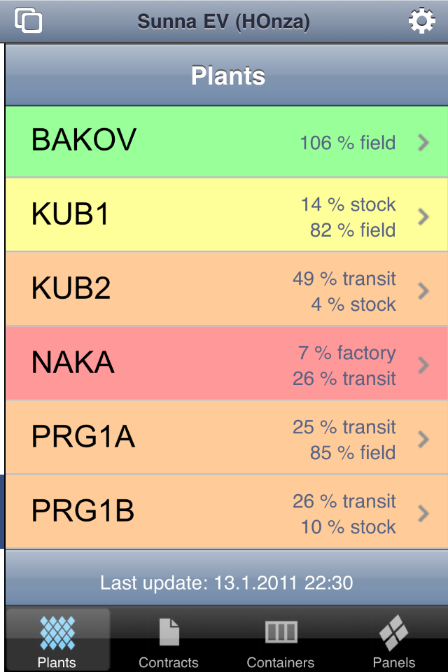
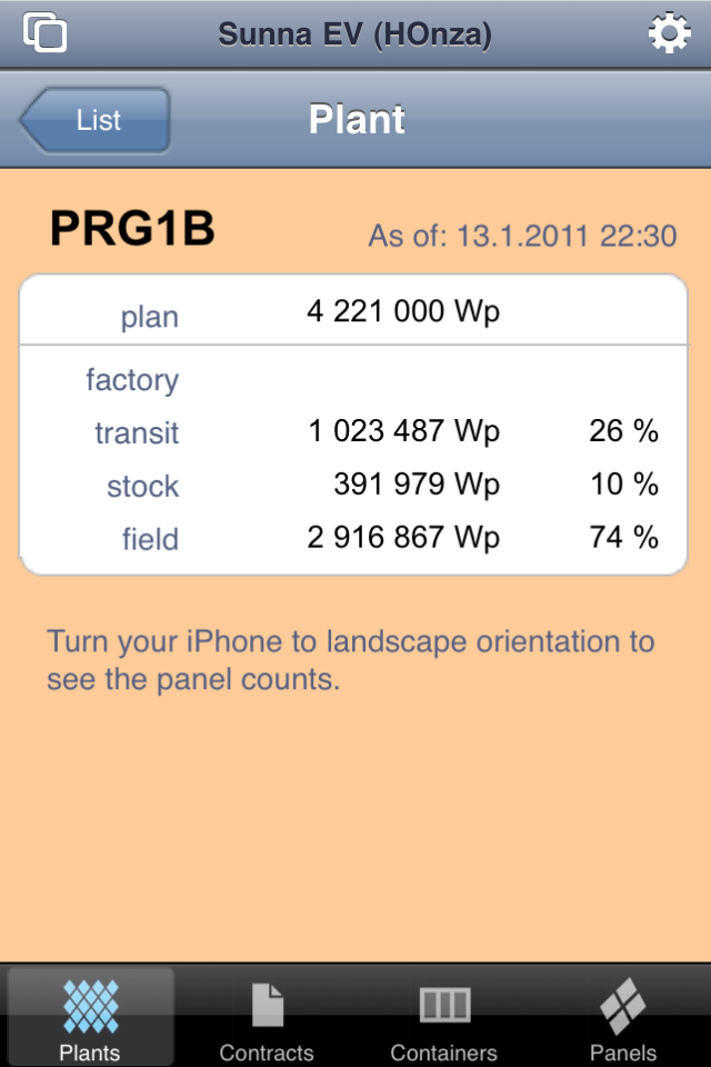
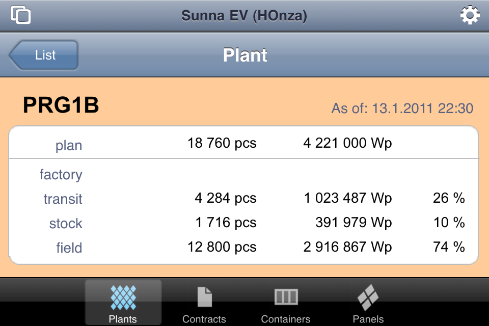
First Lesson: I can reasonably display only 2-3 columns of data in the portrait orientation and only 3-4 columns in the landscape orientation on iPhone.
That was painful. I spent over an hour trying to find a way how to display more information on the layout. Until I finally discovered what was so obvious – my second lesson:
Second Lesson: The question is not how to fit more information in the limited space. The question is how to select the most important information to show and give up the rest.
Once I asked myself the correct question, I quickly came up with a design consisting of one list layout and one detail layout. Still not dispalying all the information as the desktop version, but definitely showing the most important information you may want to see as a manager when checking the database from the go.
Majority of the layouts I have created during the 19 years of my working with FileMaker Pro had one thing in common. Many fields, all using the same font size, format, most of them of the same size, precisely aligned. Looking at it from the new point of view I discovered that all these layouts make it difficult to quickly find the most important information. So here’s my third lesson:
Third Lesson: When designing a database layout, always make sure to perfectly understand the meaning and importance of every single piece of information displayed, and make the most important information immediately visible, even when looking at the layout from distance.
Let me add one more…
Fourth Lesson: Always design at least a few layouts for new platforms even if the customer does not ask for them. Especially when the new platforms bring new limitations. You'll get a new viewpoint and learn to think differently about things you have been doing still the same way for a long time.
We all keep learning for our whole lives without any doubt. But even though I am aware of this old truth, I am always amazed where and how I learn new things and how is everything related.
So these are my first lessons learned from FileMaker Go development. And what are yours?


