Last week Hal Gumbert mentioned on Twitter that he was “working on a FileMaker quote to display and edit a BOM ( Build of Materials ) that can go 9 levels deep.”
Probably the most efficient and user friendly way to implement this is using a tree view with collapsible/expandable items. This is nothing new and very nice techniques have been already published by several FileMaker Developers, including SeedCode’s Hierarchy Template.
What captured my eyes (and mind) was Hal’s mention that he was “Planning for infinite…”
This looked like the kind of challenge I like.
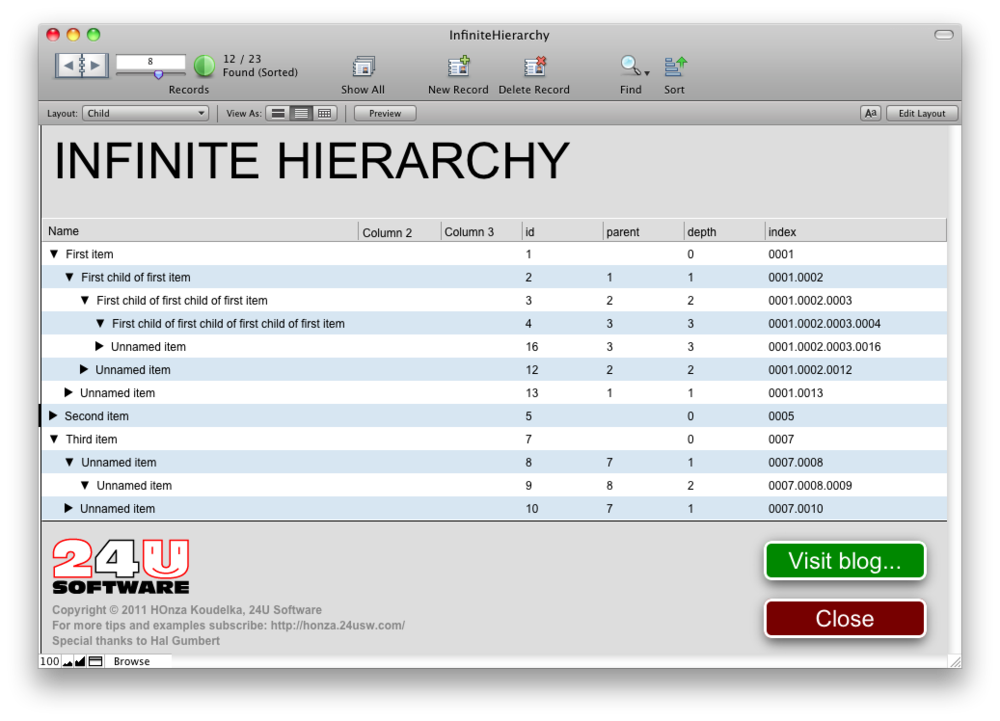
OK, as far as displaying the tree view is concerned, it’s also nothing new. An implementation based on recursive custom function (well, so it’s actually limited by the maximum recursion depth, but that’s high enough to be reasonably “infinite”) was published by Matt Petrowsky on the ISO FileMaker Magazine’s website. In my implementation, it looks like this:

But what I wanted to achieve was a bit more intuitive user experience. I wanted to be able to click on the triangle to expand or collapse the specific item and to click on the item name to edit it. Just like you can control the List view in Mac OS X’s Finder. That was the real challenge.
Since the triangle’s horizontal position is changing depending on the item’s depth, you cannot place the collapse/expand button on a fixed place. If you can limit the hierarchy depth, you can create buttons for every depth’s triangle position. But you cannot create unlimited number of buttons…
So we discussed this with Hal briefly over Skype and interestingly got the same idea at the same time (actually Hal got the idea a few seconds sooner). The solution is what I like the most. Simple and clean.
You probably know that FileMaker Pro lets you choose between two different behaviors for a text field when you click on it. You can
- select the entire contents
- or place the cursor in the middle of the text right where you have clicked
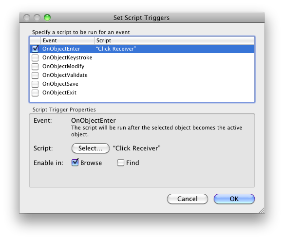
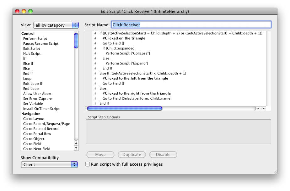
The second option is the default behavior. Now think. FileMaker Pro has a function to return the current selection start and length – Get(ActiveSelectionStart). Since the tree display is actually generated as calculated text, including the triangle, you can allow entry into the text field and then check the cursor position. Then you can use an OnObjectEntry script trigger to do this right after clicking on the field. And that’s it. Simple and clean…

 Now I can easily recognize whether the user clicked on the triangle, on the item name, or in the empty space on the left side of the triangle.
Do you want to try it out yourself? Just click here to download the sample file and open it using FileMaker Pro 10 or newer.
Unfortunately, this technique does not work with FileMaker Go. But that’s not so big deal because even iPad has quite limited screen space, so you will want to use another approach anyway.
Now imagine you have a text field 100 pixels wide and 100 pixels high. It contains 10 lines of text with 10 tabs on each line. Line spacing is set to 10 pixels and tabs are placed on every 10 pixels. How would you utilize this? :-)
Enjoy, and feel free to leave your comments or questions below.


