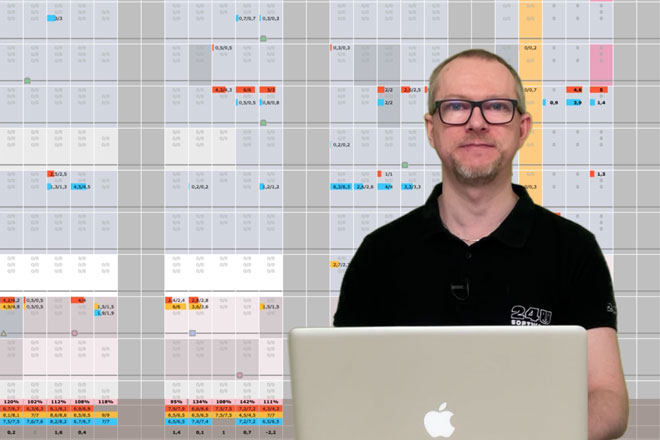
We use our own app called Collector to manage our software development projects. A few years ago my colleague Milan started feeling the need to schedule our development capacity more precisely. So we created a detailed plan layout. In the following video you can see what the layout looked like and how we later optimized it using Web Viewer and JavaScript.
In the detailed plan we display all the projects a selected team is supposed to work on in a selected month. Allocated capacities are organized by hours per developer per project per day and visualized as color bars, where each team member has a different color. We have 31 columns to represent individual days in the month, and one line per developer for each project.
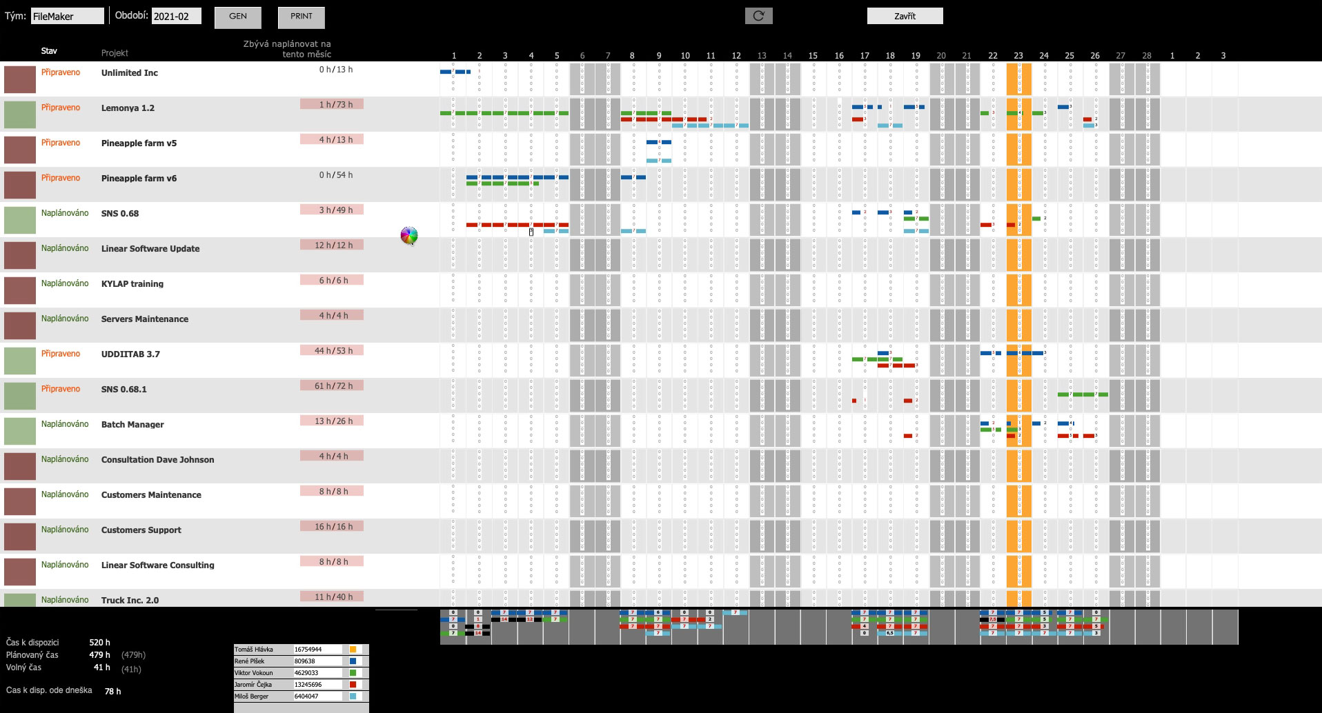
In the first version of the layout, we used a list view with 31 filtered portals in the body part and another 31 portals in the footer to show summaries.

Every portal contained 5 fields in order to show all the information we needed in a lucid calendar view. With 15 projects shown on the screen and 5 developers in the team this required FileMaker Pro to render 11 625 fields just for the calendar part of the layout.
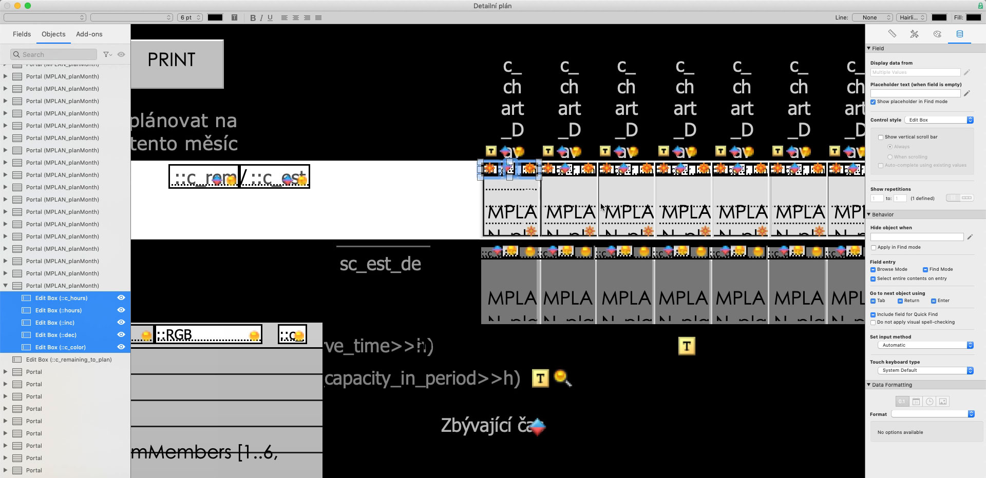
It was quite fast and easy to develop and FileMaker proved to be a great tool to quickly find out what was the right level of detail we needed to visualize the data in a way that allowed us to immediately see when the team is going to be very busy and when we have some space available.
For a day-to-day use, however, the FileMaker’s layout rendering engine turned out to be not so ideal for so many objects, because even changing a single value caused it to take a few seconds to refresh the whole layout and we had to wait for the refresh to complete before we could change another value.
So once we knew what we wanted from it, we re-created the detailed plan view as a web app and integrated it in the layout using the Web Viewer object.
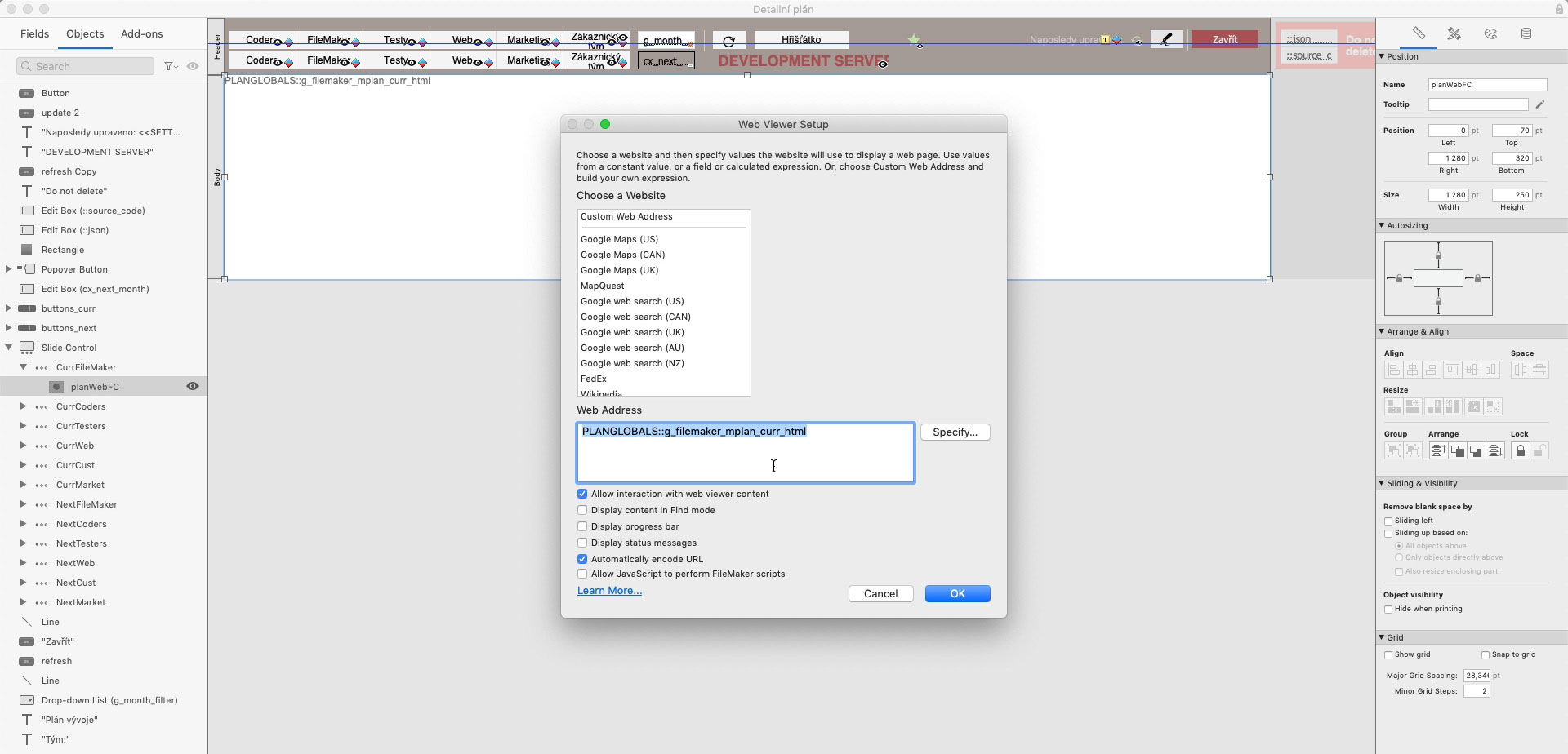
With a little bit of JavaScript and AJAX, our web developers were able to make the user interface so fast that a responding to any change takes less time than an eye blink. All changes are also immediately sent back to our database via fmRESTor and FileMaker Data API and post-processed in server-side scripts.
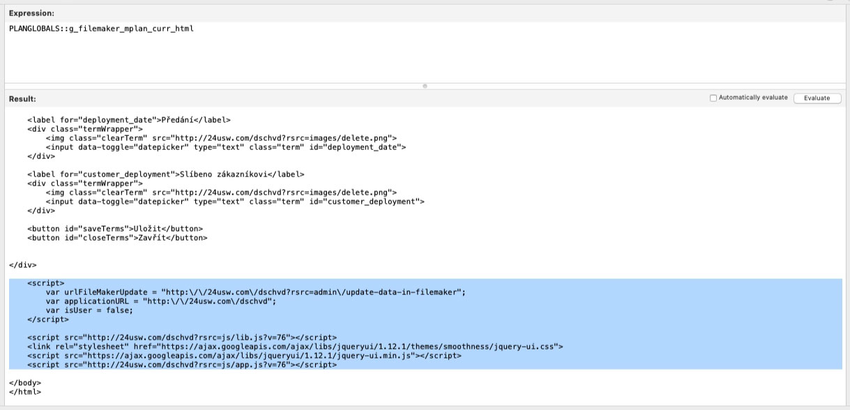
Thanks to using HTML and CSS, we were also able to include more than just the fields we used to have in the first version. Today we have also visual indicators for project milestones and other useful information embedded directly into the calendar view.
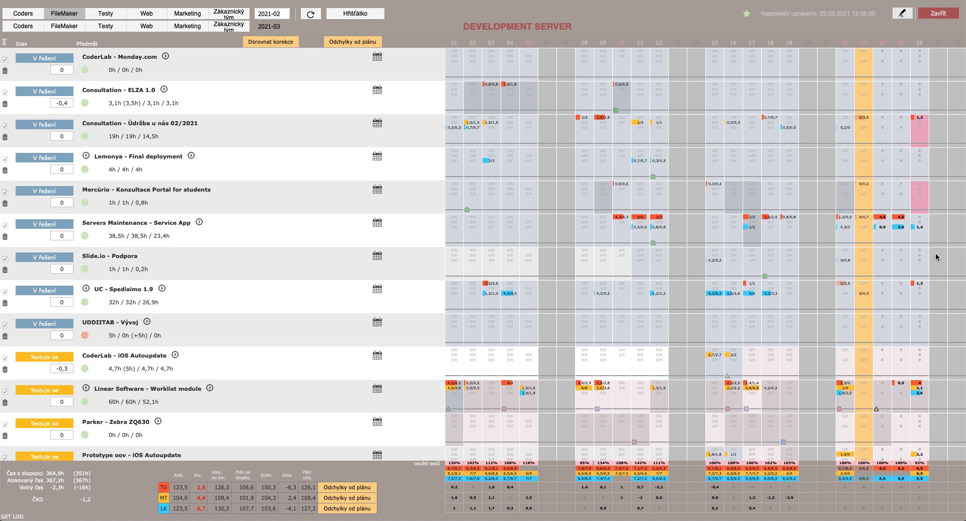
With the first version it typically took Milan the whole day, and often more, to prepare a 1-month schedule for the whole team. Then he also needed to adjust it on daily basis as we had to deal with unexpected events, support requests and other surprises. With just the basic functionality the layout was already beyond what FileMaker was able to reasonably handle.
Today, with the web-based view, preparing the whole month schedule is possible within about an hour, Milan has more information available and there is even enough space for adding new features, such as looking at data from all teams simultaneously.
Our detailed development schedule is a great example of how you can choose from a variety of technologies for the same thing and use the right technology for each component of your app, even while still staying within the rapid development environment of the FileMaker platform. If you’re dealing with a similar challenge and looking for help, feel free to get in touch.


